Smartwatch Wars: The Apple Watch versus Android Wear, in screenshots
Apple makes a more complex, all-black UI, while Google goes airy and image-heavy.
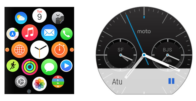
No one has really figured out what a smartwatch should look like yet, but one thing is for sure: Google and Apple have taken vasty different routes to getting a computer on your wrist. To show just how different, we put together this gallery of similar screens from the Apple Watch and Android Wear. They should be easy enough to tell apart: the Apple Watch is the square one, while the Android Wear screenshots are all from the Moto 360 and therefore (mostly) round.